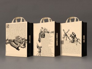
 “You don’t get a shopping bag when you shop online—you get a box,” says Glenn Kaplan, Barnes & Noble’s creative director. The company distributes more than 90 million bags a year, making the totes one of its most effective advertising campaigns. That’s why its latest bags, featuring first pages from a classic work of literature in a florid serif font, signal a return to traditional bookselling roots. After making their debut last month in New York, the redesigned bags will eventually spread across the country.
Barnes & Noble has a long, rich tradition of graphic excellence, starting with the original 1970s bag designed by Tibor Kalman, the chain’s first creative director and the founder of the New York design firm M&Co. Kalman used an ornate woodblock motif to portray a book scribe from the pre-Gutenberg era. The latest bags also evoke an old-fashioned etching, with the words set in a serif font and forming an image evocative of the story. For The Wizard of Oz, for instance, the feet of the Wicked Witch of the East poke out from a house composed of text; for Moby Dick, a whale’s tail plunges into an ocean of letters.
The play of words and image makes “the books literally come to life,” says Sagi Haviv, a partner at Chermayeff & Geismar & Haviv, the New York–based design firm responsible for the new look. Rather than placing the logo front and center, Haviv deliberately tucked the company name and website in the gussets.